Rama Estudiantil FIE-IEEE
Menu Principal
- Start
- About us
- The IEEE
- Service
-
Events
- Upcoming Events
- Made Events
-
Galery Events
- PIFIE 3.0
- 3rd day links with industry
- Technological from Zamora
- Sectional Metting Student Branches CINVESTAV Guadalajara
- ROPEC 2011
- Technological from La Piedad
- Chess tournament
- Out Door Science
- 2nd day links with industry
- GOLD Dinner
- International ROPEC 2010 Manzanillo-Colima
- RRR 2010 La Paz-Bolivia
- Road Show UVAQ
- LAPEM
- EISA Transformers
- Teaching Leadering
- Robotics
- Donwloads
- Students
- Contact
- Blog
Emblem

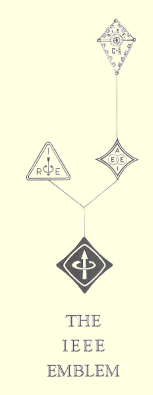
The IEEE emblem would soon make its appearance on the campuses of universities worldwide as the green and gold logo of student members. It is a new emblem, but incorporates a venerable tradition. Its evolution, shown on the right, began nearly 80 years.
Representing an organization formed by the consolidation of AIEE and IRE, IEEE emblem derives its design of the insignia of the two components. However, there is a number composed of these two components. Rather, the trend toward an emphasis on the characteristic of not only the basic concepts of the evolution of the emblems of the constituent organizations, but the education and practice of electrical engineering of the whole. In this, it also complies with the best modern design and traditional precursión.
The emblems of the IRE and AIEE had thrust the association as electricity and magnetism, perhaps the most fundamental concept that lent itself to the plot. In one case, two arrows represent the strength motirz current and magnetism. In the other, linked circles suggest the ratio of electric and magnetic fields. In IEEE, and in their organizations of their precursors, the choice of an emblem was the subject of more careful consideration.
AIEE was founded in 1884. Its first member badge, shown here, was adopted in 1893 after three years of discussion during which several designs were submitted by a committee headed by Dr. Alexander Graham Bell, AIEE president in 1891-
Its contour represented Franklin's kite. Its periphery was marked by an actual coil of gold wire with the midpoints completed traversed by a galvanometer with a steel needle and blue covered amber disc. So, was designed to cover the Wheatstone bridge, early observation of electrical phenomena of Thales and the source of the word electricity (Amber is elektron in Greek). For good measure, Ohm's law and AIEE letters were printed in gold enamel base supporting this remarkable condensation of the history of electrical science. It was abandoned after four years.
In 1897, AIEE adopted the emblem that was essentially unchanged from 1963 until the merger. Here the focus is linked circles representing the ratio of electric and magnetic fields. The symmetric boundary approximates a hypocycloid of four arches. You can even suggest a kite and a Wheatstone bridge, but in any case gives a balanced distribution of the four initial society. The IRE, founded in 1912, as a consolidation of the society of The Society of Wireless Telegraph Engineers and of The Wireless Institute, choosing the familiar triangle and arrows representing electric and magnetic forces in the conventional relationship "right hand rule ". Choosing as its emblem this fundamental concept, the IRE rejected designs its predecessor organizations, SWTE and TWI, who had used their badges Hertz oscillator and loop current recepción.Sin however important or historical meanings, specific techniques or team were symbols wisely judged unsuitable for a dynamic organization. The triangular shape of the emblem of the IRE exhibition also served for a balanced three initials.
The new IEEE emblem, rationally evolved and retains its precursors in outline and main characteristics of each recognizable. Was provided and designed by competent artists. Can be used with pride in their appearance and in the organization he represents. The degrees of membership are identified by color. The student member badge has a green field with the border and the central figure yellow gold. The affiliate is brown, light blue Member, Senior Member navy. The badge is yellow gold companion everywhere except the two arrows are white gold. The new IEEE student members receive the currency of choice. Others may purchase for $ 1.00 (*). The IEEE emblem is protected by registration with the U.S. government and can be used only by members and with respect to the business of IEEE.